In Part 12 of this series, we saw our first example of a Vue Single File Component (SFC) via the file src/App.vue.
The idea with Single File Components is to organize together all the JavaScript, HTML, and CSS of a specific entity or component of your application into one file. Within the JavaScript, you will define all the Vue options (data, computed properties, methods, watchers, etc.) necessary for that component, and each component will be set up as its own Vue instance.
Here’s a diagram for a generic site so you can visualize how things might be broken down into components:
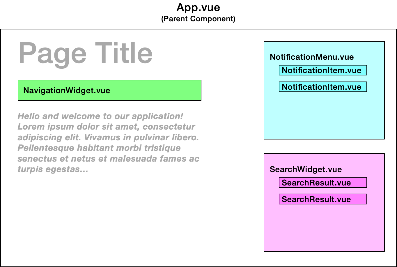
Two key benefits of SFCs include:
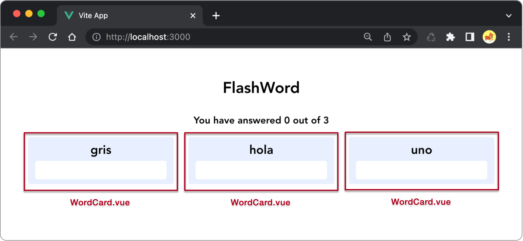
To practice with components, let’s adapt our FlashWord code so that each word card on the page is built via a component:
To do this, create a new file Single File Component /src/components/WordCard.vue with the following code:
<script>
export default {
    name: 'WordCard',
    props: ['word'],
    methods: {
        checkAnswer() {
            // When referencing props, prefix with the `this` keyword
            this.word.correct = this.word.word_b == this.word.answer;

            if (this.word.correct) {
                // Emit the custom event `incrementCorrectCount` to the parent component that is utilizing this component
                this.$emit('incrementCorrectCount');
            }
        }
    }
}
</script>

<template>
    <div class='card' v-bind:class='{ correct: word.correct}'>
        <p class='word'>{{ word.word_a }}</p>
        <input
            v-if='!word.correct'
            type='text'
            v-model='word.answer'
            v-on:keyup.enter='checkAnswer()'>

        <p v-else class='correctAnswer'>{{ word.answer }}</p>
    </div>
</template>

<style scoped>

/* The scoped attribute means that these styles will only apply to elements in this component */

.card {
    background-color: #E8F0FF;
    border-radius: 5px;
    padding: 10px 0;
    font-size: 25px;
}

input[type=text] {
    border: 0;
    font-size: 25px;
    border-radius: 5px;
    margin-top: 5px;
    text-align: center;
    padding: 5px;
}

.word {
    font-weight: bold;
    padding: 0;
    margin: 0;
}

.correctAnswer {
    padding: 0;
    margin: 0;
}

.correct {
    color: #0f5132;
    background-color: #d1e7dd;
}

</style>
Here are the important things to observe about the above code:
word.checkAnswer was extracted and adapted from our parent App.vue component. It makes sense that this method would now belong within our WordCard component because it’s central to the functionality of that component.checkAnswer, we see how we can emit a custom event called incrementCorrectCount to the parent component. In the next section we’ll see how to amend App.vue to handle this event.App.vue into the <style scoped> element within WordCard.vue. The scoped attribute indicates that these styles should only apply to elements within this component.Key points
With everything in WordCard set up, let’s turn our attention to App to utilize this component.
First, update the JavaScript in src/App.vue to import the new WordCard component:
import WordCard from './components/WordCard.vue'
And update the options to include a new component option that registers the WordCard component:
export default  {
    /* Register any components we will use in this component */
    components: {
        WordCard
    },
    /* The following options were abbreviated for brevity */
    data() {return {} },
    computed: {},
    watch: {},
    methods: {}
}
Additionally, update the App template to utilize the WordCard component within div#cards:
<div id='cards'>
    <WordCard
      v-for='word in shuffledWords'
      v-bind:word='word'
      v-on:incrementCorrectCount="incrementCorrectCount"></WordCard>
</div>
Observations about the above code:
<WordCount></WordCount>.word, which we pass in via the v-bind directive.incrementCorrectCount which we listen for here via the v-on directive. In response to this event, we invoke a method called incrementCorrectCount which you should add to your App methods, as shown in the following code. While you’re updating methods, you can also delete the checkAnswer method which is now handled in the WordCount component.export default {
components: {
WordCard
},
data() { return { /* Redacted for brevity */ } },
computed: { /* Redacted for brevity */ },
watch: { /* Redacted for brevity */ },
methods: {
incrementCorrectCount() {
this.correctCount++;
}
}
}
Load your application in the browser and test it out. It should work exactly as it did before, as we haven’t changed any of this apps functionality - only how it was built behind the scenes.
No subscriptions, no auto-renewals.
Just a simple one-time payment that helps support my free, to-the-point videos without sponsered ads.
Unlocking gets you access to the notes for this video plus all 200+ guides on this site.
Your support is appreciated. Thank you!